This post shows a step by step process to explore and select significant features in Oxford Parkinson’s Disease Detection Dataset.
-
Dataset: https://archive.ics.uci.edu/ml/datasets/Parkinsons
-
Dataset information: This dataset is composed of a range of biomedical voice measurements from people with Parkinson’s disease (PD) or without PD. Each column in the table is a particular voice measure, and each row corresponds one of voice recordings from these individuals (“name” column). The main aim of the data is to discriminate healthy people from those with PD, according to “status” column which is set to 0 for healthy and 1 for PD.
‘Exploiting Nonlinear Recurrence and Fractal Scaling Properties for Voice Disorder Detection’, Little MA, McSharry PE, Roberts SJ, Costello DAE, Moroz IM. BioMedical Engineering OnLine 2007, 6:23 (26 June 2007)
Loading dataset
import pandas as pd
import numpy as np

url = 'https://archive.ics.uci.edu/ml/machine-learning-databases/parkinsons/parkinsons.data'
data_set = pd.read_csv(url)```

## *Exploring and Cleaning*
Initial data exploration gives us some insight about the size of dataset, data types and class labels. Looking at our data reveals that all the features are numeric with a binary class label named "status". We remove the "name" column as it doesn't contain useful information for the purpose of our analysis.

```python
print(data_set.shape)
data_set.head()
(195, 24)
| name | MDVP:Fo(Hz) | MDVP:Fhi(Hz) | MDVP:Flo(Hz) | MDVP:Jitter(%) | MDVP:Jitter(Abs) | MDVP:RAP | MDVP:PPQ | Jitter:DDP | MDVP:Shimmer | MDVP:Shimmer(dB) | Shimmer:APQ3 | Shimmer:APQ5 | MDVP:APQ | Shimmer:DDA | NHR | HNR | status | RPDE | DFA | spread1 | spread2 | D2 | PPE | |
|---|---|---|---|---|---|---|---|---|---|---|---|---|---|---|---|---|---|---|---|---|---|---|---|---|
| 0 | phon_R01_S01_1 | 119.992 | 157.302 | 74.997 | 0.00784 | 0.00007 | 0.00370 | 0.00554 | 0.01109 | 0.04374 | 0.426 | 0.02182 | 0.03130 | 0.02971 | 0.06545 | 0.02211 | 21.033 | 1 | 0.414783 | 0.815285 | -4.813031 | 0.266482 | 2.301442 | 0.284654 |
| 1 | phon_R01_S01_2 | 122.400 | 148.650 | 113.819 | 0.00968 | 0.00008 | 0.00465 | 0.00696 | 0.01394 | 0.06134 | 0.626 | 0.03134 | 0.04518 | 0.04368 | 0.09403 | 0.01929 | 19.085 | 1 | 0.458359 | 0.819521 | -4.075192 | 0.335590 | 2.486855 | 0.368674 |
| 2 | phon_R01_S01_3 | 116.682 | 131.111 | 111.555 | 0.01050 | 0.00009 | 0.00544 | 0.00781 | 0.01633 | 0.05233 | 0.482 | 0.02757 | 0.03858 | 0.03590 | 0.08270 | 0.01309 | 20.651 | 1 | 0.429895 | 0.825288 | -4.443179 | 0.311173 | 2.342259 | 0.332634 |
| 3 | phon_R01_S01_4 | 116.676 | 137.871 | 111.366 | 0.00997 | 0.00009 | 0.00502 | 0.00698 | 0.01505 | 0.05492 | 0.517 | 0.02924 | 0.04005 | 0.03772 | 0.08771 | 0.01353 | 20.644 | 1 | 0.434969 | 0.819235 | -4.117501 | 0.334147 | 2.405554 | 0.368975 |
| 4 | phon_R01_S01_5 | 116.014 | 141.781 | 110.655 | 0.01284 | 0.00011 | 0.00655 | 0.00908 | 0.01966 | 0.06425 | 0.584 | 0.03490 | 0.04825 | 0.04465 | 0.10470 | 0.01767 | 19.649 | 1 | 0.417356 | 0.823484 | -3.747787 | 0.234513 | 2.332180 | 0.410335 |
data_set.dtypes
We split our dataset into data X and label y.
X = data_set.iloc[:,1:].drop(labels="status", axis=1)
y = data_set["status"]
print(f'data: {X.shape}\nlabel: {y.shape}')
data: (195, 22) label: (195,)
y.value_counts()
print(f'Number of patients diagnosed with PD: {y.value_counts()[1]}')
print(f'Number of patients without PD: {y.value_counts()[0]}')
Number of patients diagnosed with PD: 147 Number of patients without PD: 48
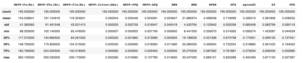
X.describe()
Handling Missing Data
A quick check shows our dataset does not have any missing value to either drop or fill.
X.isna().sum(axis=0).sum(axis=0)
0
Visualization
import matplotlib.pyplot as plt
from mpl_toolkits.mplot3d import axes3d
import seaborn as sns
import numpy.linalg as LA
from scipy import stats
Violin Plot
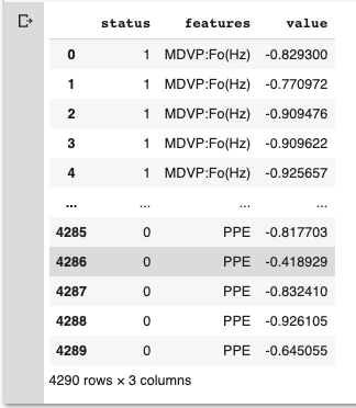
We look at each feature to see its distribution and relationship in respect to the class label. Before plotting we normalize our data to be able to visualize all features in one plot and compare them together.
scaler = StandardScaler()
z_fit = scaler.fit_transform(X)
Z=pd.DataFrame(data=z_fit, columns=X.columns)
Z_join = pd.concat([y, Z.iloc[:,:]], axis=1)
data = pd.melt(Z_join,id_vars="status", var_name="features", value_name='value')
data
plt.figure(figsize=(26,10))
sns.violinplot(x="features", y="value", hue="status", data=data,split=True, inner="quart")
plt.xticks(rotation=90)
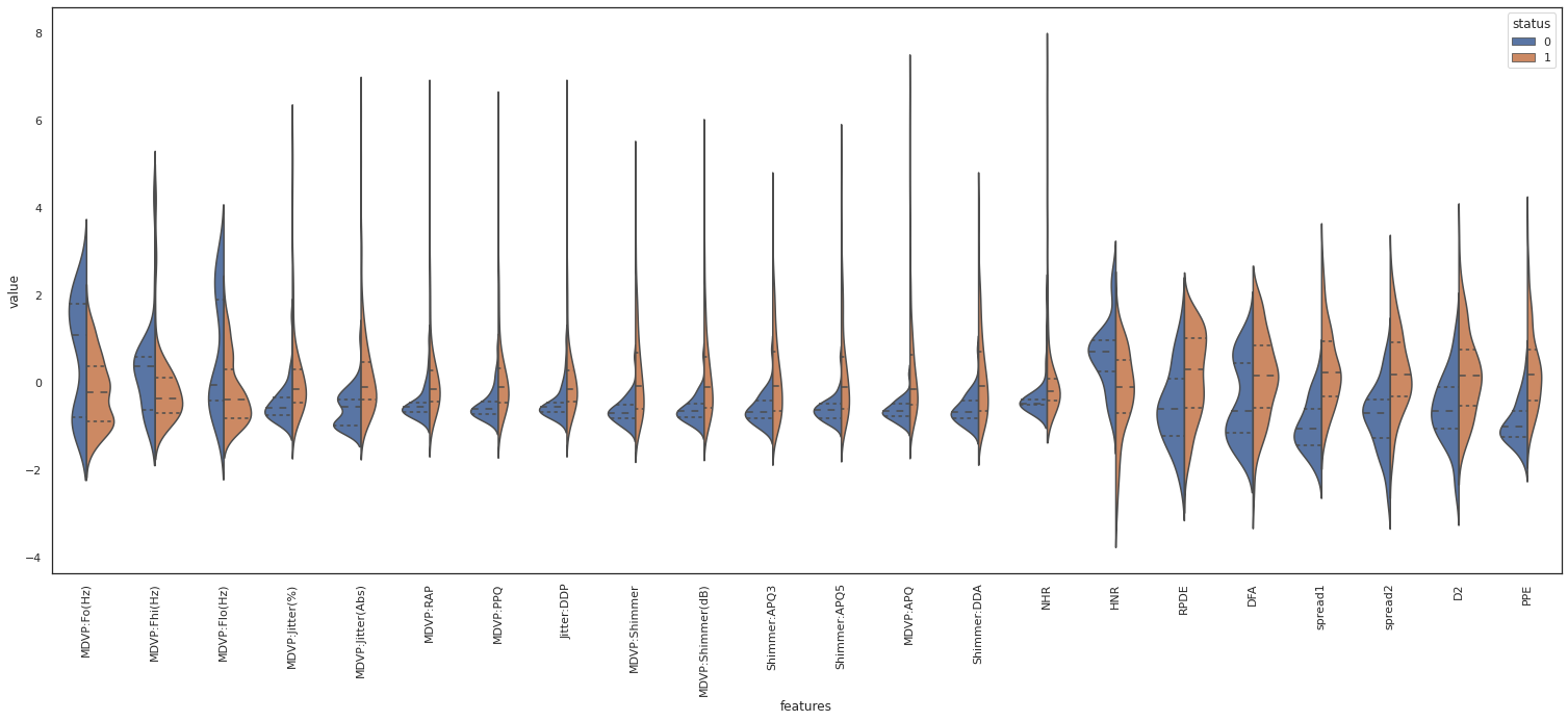
For example PRDE, spread1 and PPE show a separation of their median value based on the class label. Therefore those variables are deemed important for “status” classification. On the other hand, NHR shows the same median for both classes. So it doesn’t seem to be direcetly related to the class label.
Box plot
Alternatively we can create box plot to get quartiles information for each feature.
plt.figure(figsize=(26,10))
sns.boxplot(x="features", y="value", hue="status", data=data)
plt.xticks(rotation=90)
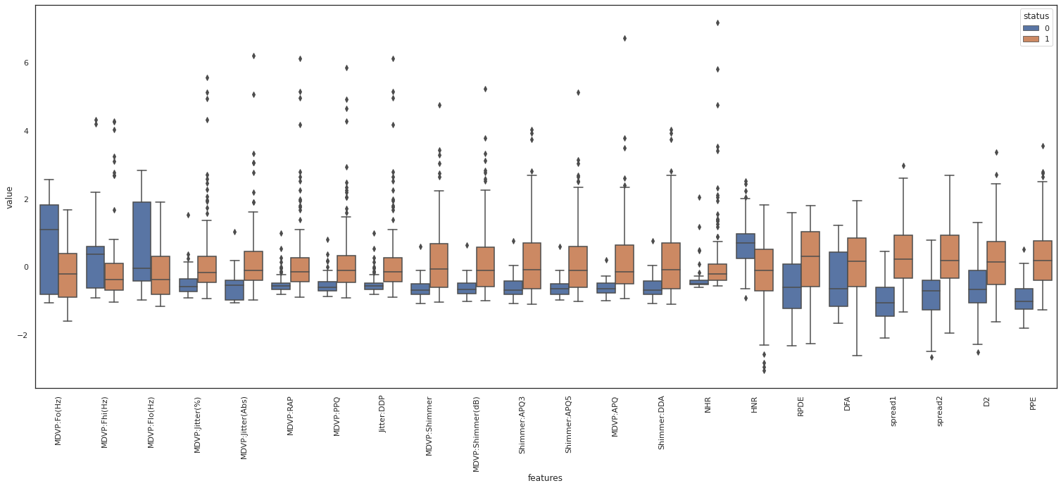
From the above box plot we observe that MDVP features have similar range of values and distribution. Provided they are corrolated we can drop the redundant features.
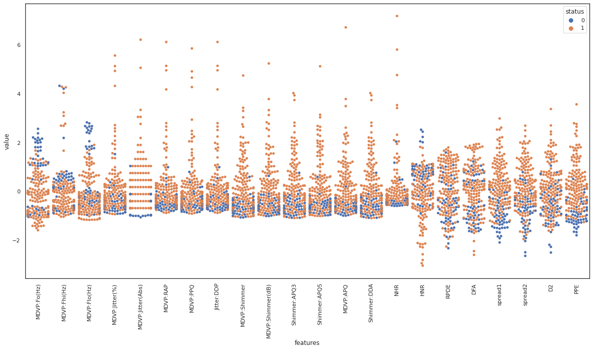
swarmplot
swarmplot shows all the observations in the same context as violin or boxplot. We observe spread1 and PPE seem to be good features to separate the dataset based on the class label. On the contrary, class labels are spread across DFA, and it does not seem to be a good candidate to separate the data based on the class label.
plt.figure(figsize=(20,10))
sns.swarmplot(x="features", y="value", hue="status", data=data)
plt.xticks(rotation=90)
joinplot
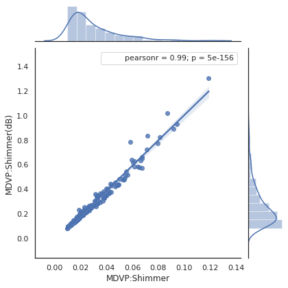
Moving to statistical analysis we are going to verify some of the observations that we made earlier. Below we see a correlation factor of 0.99 between two of the MDVP features, confirming a strong linear correlation. This is a redundancy in the dataset that can be removed.
def plot_join_plot(df, feature, target):
  j = sns.jointplot(feature, target, data = df, kind ='reg')
  j.annotate(stats.pearsonr)
  return

plot_join_plot(X, 'MDVP:Shimmer', 'MDVP:Shimmer(dB)')
plt.show()
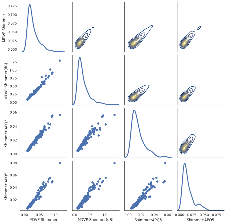
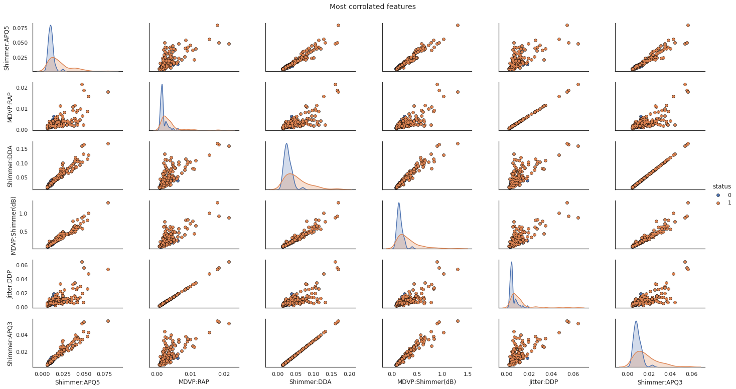
pairplot
To evaluate the correlation of multiple variable at the same time we use PaiGrid from seaborn library.
sns.set(style="white")
df1 = X.loc[:,['MDVP:Shimmer','MDVP:Shimmer(dB)','Shimmer:APQ3','Shimmer:APQ5']]
pp = sns.PairGrid(df1, diag_sharey=False)
# pp = sns.PairGrid(df1)

# fig = pp.fig
# fig.subplots_adjust(top=0.93, wspace=0.3)
# t = fig.suptitle('corrolated features', fontsize=14)
# plt.show()
pp.map_upper(sns.kdeplot, cmap="cividis")
pp.map_lower(plt.scatter)
pp.map_diag(sns.kdeplot, lw=3)
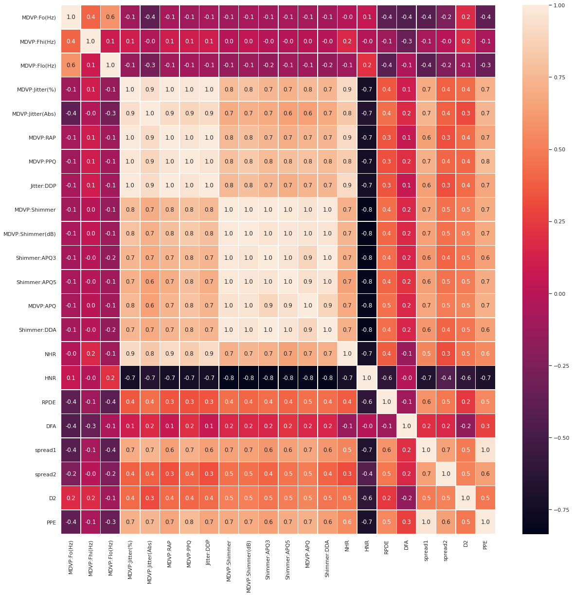
Heatmap
We use heatmap to see the correlation map of the entire features. Below are the features that are linearly correlated.
- MDVP:Jitter(%), MDVP:RAP, MDVP:PPQ, Jitter:DDP (we keep MDVP:PPQ)
- MDVP:Shimmer, MDVP:Shimmer(dB), ‘Shimmer:APQ3’, ‘Shimmer:APQ5’,’MDVP:APQ’, ‘Shimmer:DDA’ (we keep ‘MDVP:APQ’)
- spread1, PPE (we keep PPE)
We can look at the previous plots to decide which one of them we want to keep, and drop the rest.
fig,ax = plt.subplots(figsize=(20, 20))
sns.heatmap(X.corr(), annot=True, linewidths=.5, fmt= '.1f', ax=ax)
Drop linearly correlated columns
Instead of visual inspection we could have directly extract the correlation coefficients from the correlation matrix.
corr_pct = 0.98
col_corr = set()
for i in range(len(X.corr().columns)):
    for j in range(i):
        if abs(X.corr().iloc[i, j]) > corr_pct:
          print(f'{X.corr().columns[i]} and {X.corr().columns[j]} correlated by {X.corr().iloc[i, j]}')
          col = X.corr().columns[i]
          col_corr.add(col)
print(col_corr, len(col_corr), type(col_corr))
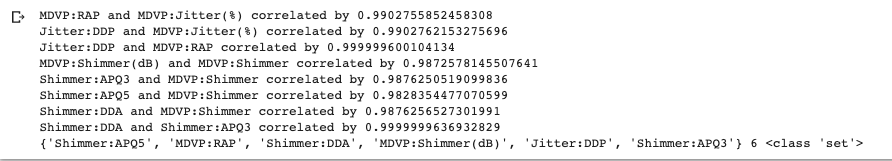
# Scatter Plot with Hue for visualizing data in 3-D
X_join = pd.concat([X[col_corr],y], axis=1)

pp = sns.pairplot(X_join, hue="status", size=1.8, aspect=1.8,
                  plot_kws=dict(edgecolor="black", linewidth=0.5))
fig = pp.fig
fig.subplots_adjust(top=0.93, wspace=0.3)
t = fig.suptitle('Most corrolated features', fontsize=14)
plt.show()
After dropping the redundant columns, The number of columns are reduced to 13.
col_drop = ['MDVP:Jitter(%)', 'MDVP:RAP', 'Jitter:DDP', 'MDVP:Shimmer', 'MDVP:Shimmer(dB)', 'Shimmer:APQ3', 'Shimmer:APQ5', 'Shimmer:DDA', 'spread1']
X = X.drop(col_drop, axis=1)
X.shape
(195, 13)
Merge cleaned up data
- In case some rows from X were removed in the process, we would need to align rows od X and y again. We use inner merge between X and y to achieve it.
df = pd.merge(X, y, left_index=True, right_index=True)
X = df[df.columns[:-1]]
y = df[df.columns[-1]]
PCA Dimension Reduction
Now let’s attempt to reduce the dimension of the cleaned up data by Principal Component Analysis technique.
Before fitting our data into PCA, it’s standardized by StandardScalar utility class.
from sklearn.preprocessing import StandardScaler
from sklearn.decomposition import PCA
from sklearn.cluster import KMeans

scaler = StandardScaler()
z_fit = scaler.fit_transform(X.values)
Z = pd.DataFrame(z_fit, index=X.index, columns=X.columns)

pca = PCA()
pca_features = pca.fit_transform(Z.values)
After fitting data into PCA model, we create the Scree plot. Looking at the cumulative sum of explained variance we need to keep only 5 component to retain 90% collective variance of our data.
X_var_ratio = X.var()/(X.var().sum())

fig1, (ax1, ax2) = plt.subplots(1,2, figsize=(18,5))
ax1.plot(range(len(X.var())), X_var_ratio.cumsum(), label="dataset features")
ax1.plot(range(len(X.var())), np.cumsum(pca.explained_variance_ratio_), label="PCA features")

ax1.set_title("Cumulative Sum of Explained Variance Ratio")
ax1.set_xlabel('PCA features')
ax1.set_ylabel('Total Explained Variance Ratio')
ax1.axis('tight')
ax1.legend(loc='lower right')

ax2.bar(x=range(len(X.columns)), height=pca.explained_variance_ratio_)

ax2.set_title('Scree Plot')
ax2.set_xlabel('PCA features')
ax2.set_ylabel('Explained Variance Ratio')

plt.show()
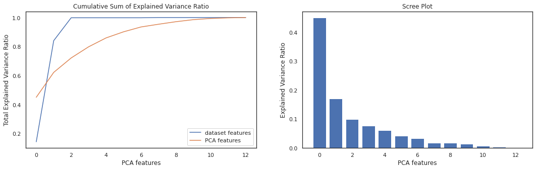
pca_num = (np.where(np.cumsum(pca.explained_variance_ratio_) > 0.9))[0][0]
pca = PCA(pca_num)
pca_features = pca.fit_transform(Z.values)
print(pca_features.shape, type(pca_features))
(195, 5) <class ‘numpy.ndarray’>
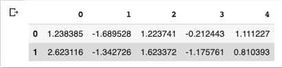
df_pca = pd.DataFrame(pca_features)
df_pca.head(2)
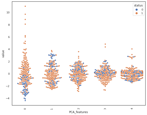
By looking at the swarmplot, we notice that principal components P0 and P3 are most related to our class label.
pca_data = pd.melt(pd.concat([df_pca,y], axis=1),id_vars="status", var_name="PCA_features", value_name='value')
plt.figure(figsize=(10,8))
sns.swarmplot(x="PCA_features", y="value", hue="status", data=pca_data)
plt.xticks(rotation=90)
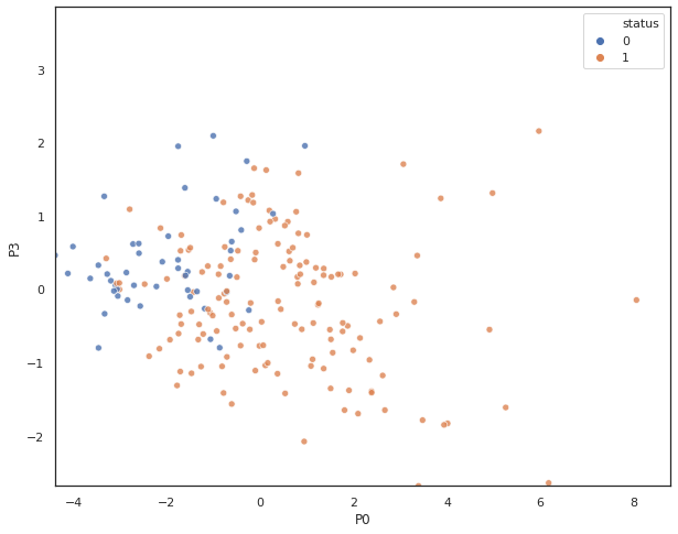
A scatter plot shows class label separation between P0 and P3.
x_data = df_pca.iloc[:,0]
y_data = df_pca.iloc[:,3]
plt.figure(figsize=(10,8))
sns.scatterplot(
    x= x_data, y= y_data,
    hue=y,
    legend="full",
    alpha=0.8
)
plt.xlim(x_data.min(),0.8*x_data.max())
plt.ylim(y_data.min(),0.8*y_data.max())
plt.xlabel("P0")
plt.ylabel("P3")

plt.show()
K-means Clustering
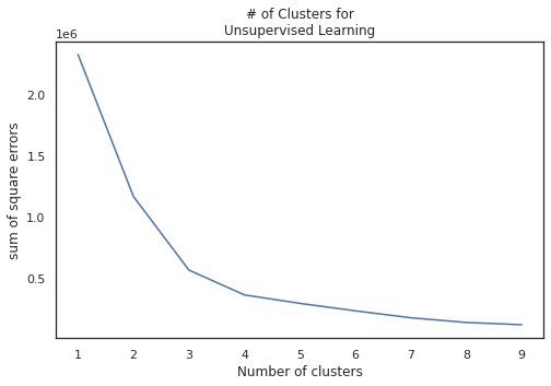
Finally we utilize PCA features to cluster our data for classification. Since our class label is binary, we partition our data into two clusters.
y.value_counts()
1 147 0 48 Name: status, dtype: int64
sqr_err = []
for i in range(1,10):
  kmeans = KMeans(i)
  # kmeans.fit(df_pca.values)
  kmeans.fit(X)

  sqr_err.append(kmeans.inertia_)

plt.figure(figsize=(8,5))
plt.plot(range(1,10), sqr_err)
plt.xlabel("Number of clusters")
plt.ylabel("sum of square errors")
plt.title("# of Clusters for\nUnsupervised Learning")
plt.show()
kmeans=KMeans(2)
kmeans.fit(X)
To show the benefit of PCA, first we run the k-means cluster on original features and then the pca features. Then we compare their class separation by creating scatter plot.
def scatter_comp(xdata, ydata, y, cluster_label):
  x_data = xdata
  y_data = ydata
  plt.figure(figsize=(16,10))

  ax0 = plt.subplot(2,2,1)
  sns.scatterplot(
    x= x_data, y= y_data,
    hue = y,
    cmap='viridis',
    legend="full",
    alpha=1,
    ax=ax0
    )
  ax0.set_xlim(x_data.min(),x_data.max())
  ax0.set_ylim(y_data.min(),y_data.max())
  ax0.set_xlabel(x_data.name)
  ax0.set_ylabel(y_data.name)
  ax0.set_title("Class label")

  ax1 = plt.subplot(2,2,2)
  sns.scatterplot(
    x= x_data, y= y_data,
    hue= cluster_label,
    cmap='viridis',
    legend="full",
    alpha=1,
    ax=ax1
    )
  ax1.set_xlim(x_data.min(),x_data.max())
  ax1.set_ylim(y_data.min(),y_data.max())
  ax1.set_xlabel(x_data.name)
  ax1.set_ylabel(y_data.name)
  ax1.set_title("Cluster Label")

  return plt.show()

scatter_comp(X["DFA"], X["MDVP:Fo(Hz)"], y, cluster_label)
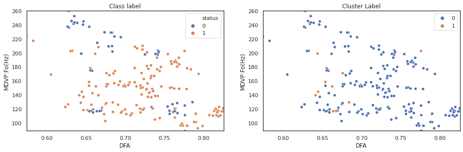
The above plot shows k-means clustering cannot effectively separate observations based on original data features. Next step, we will repeat the sam process on pca features.
kmeans = KMeans(2)
kmeans.fit(pca_features)
scatter_comp(df_pca[0], df_pca[1], y, pca_label) scatter_comp(df_pca[0], df_pca[2], y, pca_label) scatter_comp(df_pca[0], df_pca[3], y, pca_label)
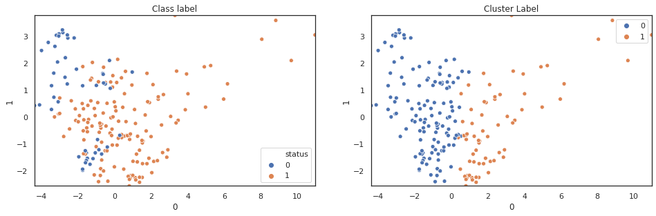
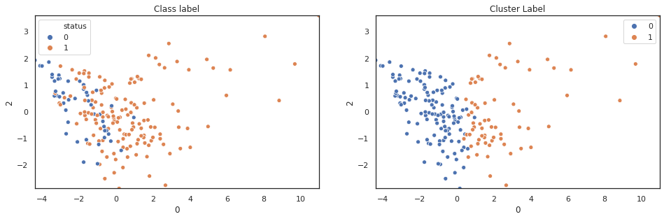
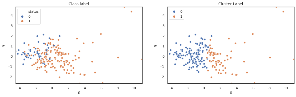
(y==pca_label).sum()/len(y)
0.6051282051282051
A larger training dataset and test dataset would give a better view of our classification performance. Nevertheless k-means clustering over pca features shows noticable classification improvement over original features.
Conclusion
The process of inspecting, visualizing, cleaning, transforming, and modeling of the data with the objective of extracting useful information and drawing conclusion is data analysis. We took a numerical dataset related to Parkinson’s disease provided by University of Oxford. We went through every steps of the above, to analyze this dataset, and show how we could extract features that could be used for classification.